Frep
The team beyond the pitch
FREP is a real estate investment platform exclusively for football professionals.
I dealt with the strategic positioning of the brand, the design, and development of all the key elements, and creative directed the other professionals involved.
I dealt with the strategic positioning of the brand, the design, and development of all the key elements, and creative directed the other professionals involved.
The Idea
A career in football is relatively short-lived in most cases. As a footballer, you live in a sort of bubble, where you are told what to eat and when.
The second you finish playing all of that disappears.
But it doesn't need to be that way. Outside of the pitch there's a career to be chased wealth to be made and a team to join to pursue all that.
That team is FREP, Football Real Estate Partnership. That's the team you want to join to succeed outside of the pitch.
FREP
The second you finish playing all of that disappears.
Outside of the pitch, you are left to your own.
But it doesn't need to be that way. Outside of the pitch there's a career to be chased wealth to be made and a team to join to pursue all that.
That team is FREP, Football Real Estate Partnership. That's the team you want to join to succeed outside of the pitch.
FREP
The Team beyond the pitch.
Visual Identity
Logotype
In the quest for an ownable look, we resolved in creating a bespoke lettering. The shapes are inspired by the monospace letters, normally adopted in the technical drawings, but some of the shapes have been redesigned to hint to the middle field element included in the mark.The result is a solid and fresh logo type,
with a strong personality and roots straight into the brand's heritage.
Logomark
The logomark hints at the nature of the business, where football meets real estate investments. So the mark takes the stereotypical shape of the football field and twists it into two pictograms of a house.
Logo animation
Typeface
Regio Mono evokes the technical captioning on blue prints and maps,
yet is modern and with interesting unique features.
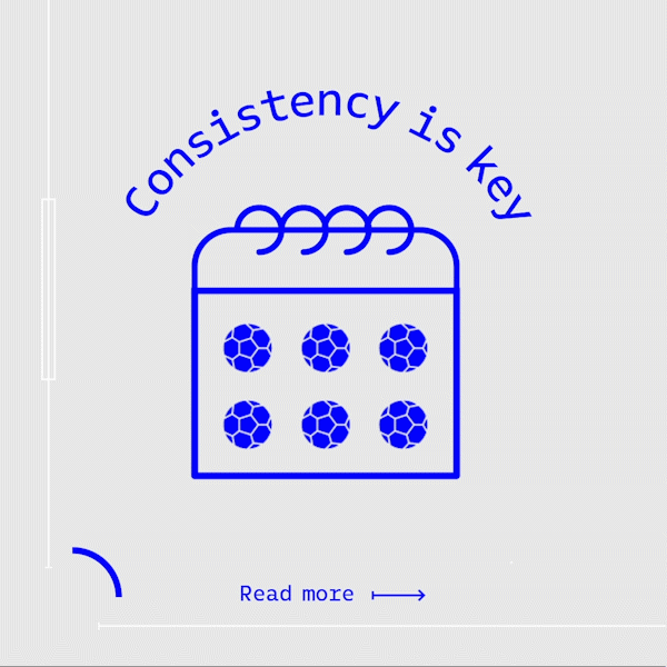
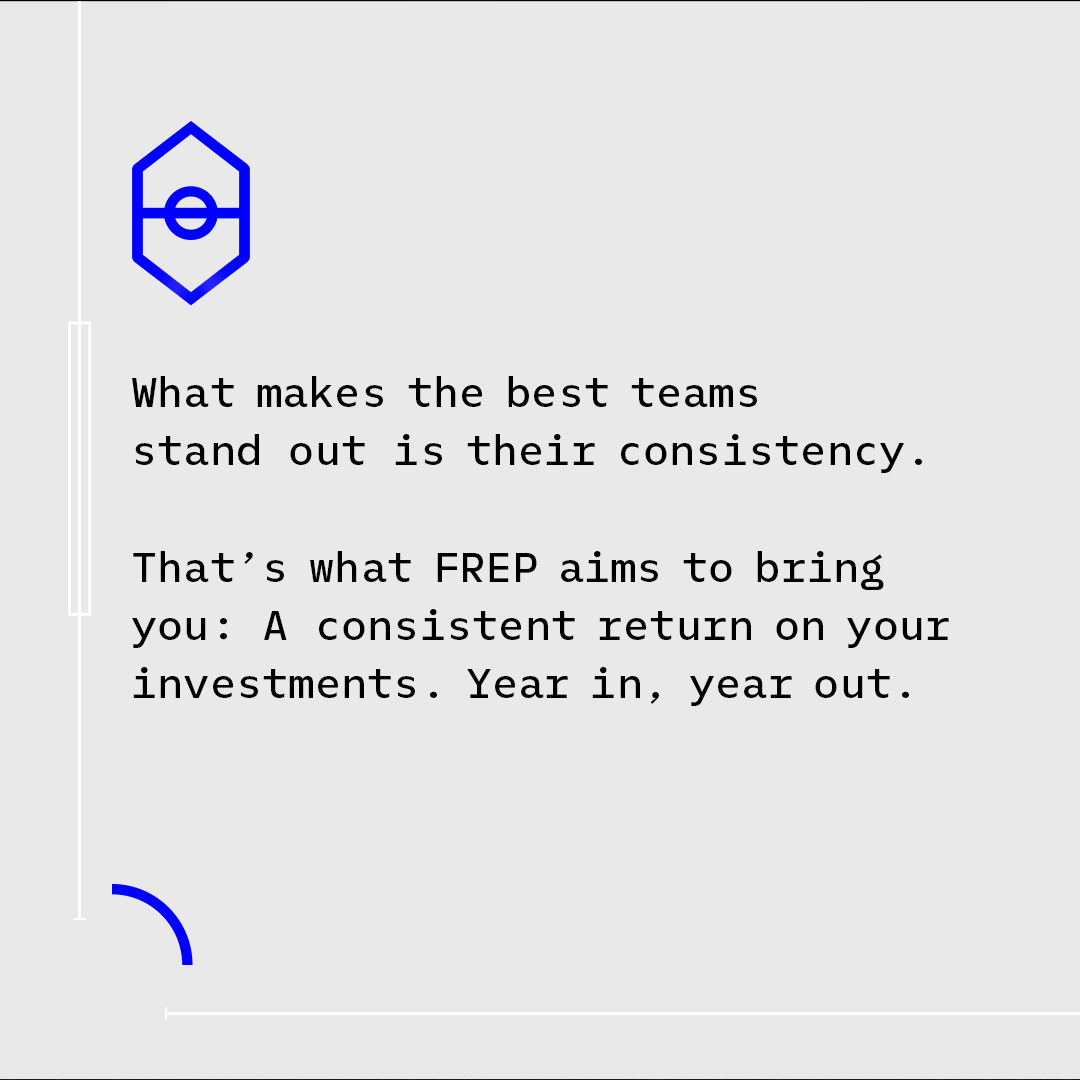
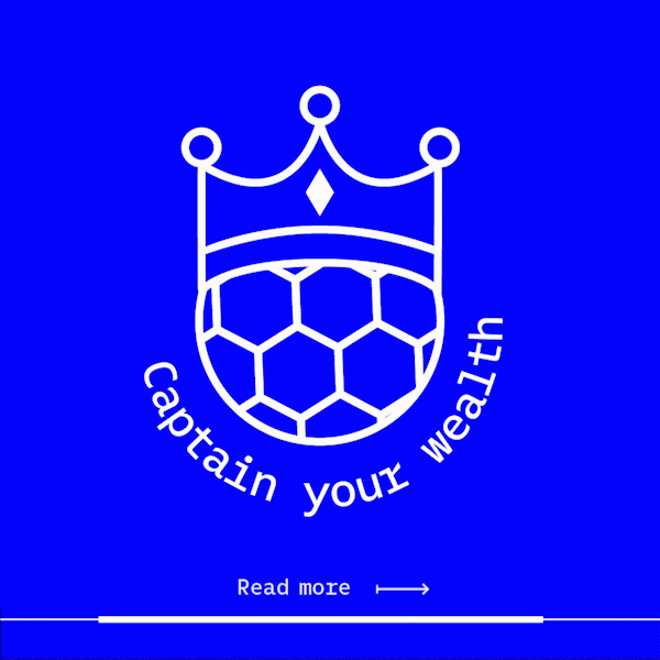
Iconography + headlines

Social
These are few examples of how the icons will be used on Frep's social.
Collateral items